前段时间分享过利用 Meta 申明来做百度开放适配,前几天在解决 sitemap 报错问题时,看到了谷歌、雅虎及微软等搜索引擎开放适配方法,感觉有点意思,就折腾了下代码,现在来分享下。虽然她被墙了,但是我们应该怀着一颗乐观向上的心,随时迎接谷姐归来。。。
一、谷歌开放适配规则
对应 URL 举例:
pc:https://zhang.ge/
移动:http://m.zhang.ge
meta 申明方法:
a)pc 页面添加 meta:
<link href=http://m.zhang.ge" rel="alternate" media="only screen and (max-width: 640px)" />
注意:640px,这里指移动设备最大宽度,只是谷歌一个举例,为了最大化适配效果,这里可以填写 9999px,张戈博客的主界面宽度为 980px,所以选择了 1000px,即告诉谷歌,当屏幕宽度小于 1000px 的将展示移动主题。
b)而在移动版网页上,所需的注释应为:
<link href="/" rel="canonical" />
c)URL 级别 sitemap:详见:https://developers.google.com/webmasters/smartphone-sites/details?hl=zh-cn#0-bdhome-1-33534-1d18d5141e8cb800a4977d54d80686cb
二、做好开放适配映射 sitemap
a)这个 sitemap 与以往的 sitemap.xml 文件格式不同,请严格遵循百度、谷歌官方指南操作
b)给百度、谷歌分别单独做一个映射 sitemap,不要做在一起(做在一起搜索引擎其实也可以识别,但是为保证效果还是分开的好)
c)单独给你的移动端网站建立一个 sitemap.xml 文件,并做好 ping 机制。
Ps:以上可参考之前张戈博客发布的相关文章:
移动 SEO 分享:php 自动提交复合型 Sitemap 到百度搜索
三、注意事项
1、将移动用户跳转至移动端网站,这个操作要过滤掉蜘蛛,从服务器端仅判断用户,避免影响蜘蛛抓取。
Ps:用张戈博客之前的方法就可以避免:完美实现移动主题在 360 网站卫士缓存全开情况下的切换
2、移动端页面去除强 PC 特征,这个不要直接把 PC 端页面结构全部搬到移动端,要注重用户体验,改删减的就删减。
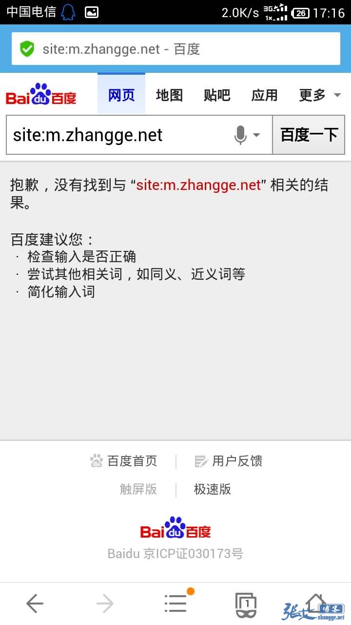
3、移动端网页的收录用 site 是查询不到的,尤其是百度。只看百度后台的适配进度、和 GA 的流量即可。
Ps:另一种查看效果的方法是在手机百度 site 电脑端域名,可以出现如下结果:
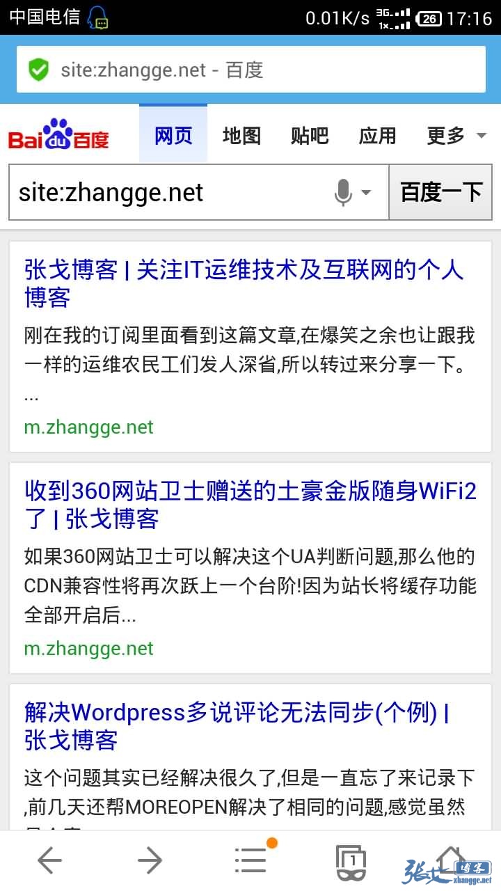
而直接 site 移动端域名则如图提示找不到(具体可以到手机端 site 一下张戈博客域名:zhang.ge)
4、移动端网页的权重是继承 PC 端的
四、张戈的做法
理论的东西看起来总是迷糊,张戈就分享一下实际的 php 动态 meta 申明代码吧!
由于每个页面都是一 一对应关系,而 wordpress 一般都是共用一个 header.php,所以我们需要在 header 里面加上打印当前页面对应的 meta 信息的语句,比如:
以下代码添加到 PC 主题的 header 中,就只会在文章页面打印对应的谷歌 meta 申明:
<?php wp_reset_query();if ( is_single()){ ?>
<!--文章页面谷歌 meta 适配申明-->
<link href="m./<?php the_ID(); ?>.html" rel="alternate" media="only screen and (max-width: 1000px)" />
<?php } ?>
然后移动主题的 header 则对应添加如下代码即可:
<?php wp_reset_query();if ( is_single()){ ?>
<link href="/<?php the_ID(); ?>.html" rel="canonical" />
<?php } ?>
以上则为一个完整的文章页面的谷歌 meta 开放适配!
依葫芦画瓢,可以得出首页、文章页、单页面及分类页的完整 meta 适配代码:
PC 主题添加:
<!--首页 meta 适配申明-->
<?php wp_reset_query();if ( is_home()){ ?>
<link href="m./" rel="alternate" media="only screen and (max-width: 1000px)" />
<?php } ?>
<!--文章页面谷歌 meta 适配申明-->
<?php wp_reset_query();if ( is_single()){ ?>
<link href="m./<?php the_ID(); ?>.html" rel="alternate" media="only screen and (max-width: 1000px)" />
<?php } ?>
<!--单页面谷歌 meta 适配申明-->
<?php wp_reset_query();if ( is_page()){ ?>
<link href="m./<?php echo the_slug(); ?>" rel="alternate" media="only screen and (max-width: 1000px)" />
<?php } ?>
<!--分类页面谷歌 meta 适配申明-->
<?php wp_reset_query();if ( is_category()){ ?>
<link href="m./<?php $catArray = get_the_category();
    $cat=$catArray[array_rand($catArray,1)];
    $cat_parent = get_category($catArray[0]->category_parent);
    if (!empty($cat_parent->slug)) {
        echo $cat_parent->slug."/";
    }
    echo $cat->category_nicename;?>" rel="alternate" media="only screen and (max-width: 1000px)" />
<?php } ?>
移动主题添加:
<!--首页-->
<?php wp_reset_query();if ( is_home()){ ?>
<link href="/" rel="canonical" />
<?php } ?>
<!--文章页-->
<?php wp_reset_query();if ( is_single()){ ?>
<link href="/<?php the_ID(); ?>.html" rel="canonical" />
<?php } ?>
<!--单页面-->
<?php wp_reset_query();if ( is_page()){ ?>
<link href="/<?php echo the_slug(); ?>" rel="canonical" />
<?php } ?>
<!--分类页-->
<?php wp_reset_query();if ( is_category()){ ?>
<link href="/<?php $catArray = get_the_category();
    $cat=$catArray[array_rand($catArray,1)];
    $cat_parent = get_category($catArray[0]->category_parent);
    if (!empty($cat_parent->slug)) {
        echo $cat_parent->slug."/";
    }
    echo $cat->category_nicename;?>" rel="canonical" />
<?php } ?>
当然,我们还有百度开放适配,只要结合以前张戈分享过的《移动搜索 SEO 分享:利用 Meta 声明来做百度开放适配》的做法,那么就可以同时做百度和谷歌的开放适配了,完整代码如下:
PC 主题添加:
<!--首页百度和谷歌 meta 适配申明-->
<?php wp_reset_query();if ( is_home()){ ?>
<meta name="mobile-agent" content="format=xhtml;url=http://m.zhang.ge/" />
<link href="m./" rel="alternate" media="only screen and (max-width: 1000px)" />
<?php } ?>
<!--文章页面百度和谷歌 meta 适配申明-->
<?php wp_reset_query();if ( is_single()){ ?>
<meta name="mobile-agent" content="format=xhtml;url=http://m.zhang.ge/<?php the_ID(); ?>.html" />
<link href="m./<?php the_ID(); ?>.html" rel="alternate" media="only screen and (max-width: 1000px)" />
<?php } ?>
<!--单页面百度和谷歌 meta 适配申明-->
<?php wp_reset_query();if ( is_page()){ ?>
<meta name="mobile-agent" content="format=xhtml;url=http://m.zhang.ge/<?php echo the_slug(); ?>" />
<link href="m./<?php echo the_slug(); ?>" rel="alternate" media="only screen and (max-width: 1000px)" />
<?php } ?>
<!--分类页面百度和谷歌 meta 适配申明-->
<?php wp_reset_query();if ( is_category()){ ?>
<meta name="mobile-agent" content="format=xhtml;url=http://m.zhang.ge/<?php $catArray = get_the_category();
    $cat=$catArray[array_rand($catArray,1)];
    $cat_parent = get_category($catArray[0]->category_parent);
    if (!empty($cat_parent->slug)) {
        echo $cat_parent->slug."/";
    }
    echo $cat->category_nicename;?>" />
<link href="m./<?php $catArray = get_the_category();
    $cat=$catArray[array_rand($catArray,1)];
    $cat_parent = get_category($catArray[0]->category_parent);
    if (!empty($cat_parent->slug)) {
        echo $cat_parent->slug."/";
    }
    echo $cat->category_nicename;?>" rel="alternate" media="only screen and (max-width: 1000px)" />
<?php } ?>
移动端主题:由于百度并未提供移动端开放适配对应的 meta,所以移动端加上谷歌的 meta 申明即可(上面已提供)。
本文代码中的分类和单页面 url 需要新增一个 function 函数,具体请参考:《完美实现移动主题在 360 网站卫士缓存全开情况下的切换》一文中的第三步。
如果你和张戈一样用的是二级域名移动站,那么这个 Meta 代码还可以继续添加|“结合 js 判断 UA 的地址的跳转代码”,可谓一举多得!篇幅有限,张戈就直接贴上自己的实际使用代码,供有心人参考使用:
百度、谷歌、雅虎、微软开放适配及手机端 UA 判断跳转代码:
<!--加载 UA 判断 JS-->
<script src="<?php bloginfo('template_directory'); ?>/js/uaredirect.js" type="text/javascript"></script>
<!--首页移动站跳转及 meta 适配申明-->
<?php wp_reset_query();if ( is_home()){ ?>
<script type="text/javascript">uaredirect("http://m.zhang.ge/");</script>
<meta name="mobile-agent" content="format=xhtml;url=http://m.zhang.ge/" />
<link href="m./" rel="alternate" media="only screen and (max-width: 1000px)" />
<?php } ?>
<!--文章页面移动站跳转及 meta 适配申明-->
<?php wp_reset_query();if ( is_single()){ ?>
<script type="text/javascript">uaredirect("http://m.zhang.ge/<?php the_ID(); ?>.html");</script>
<meta name="mobile-agent" content="format=xhtml;url=http://m.zhang.ge/<?php the_ID(); ?>.html" />
<link href="m./<?php the_ID(); ?>.html" rel="alternate" media="only screen and (max-width: 1000px)" />
<?php } ?>
<!--单页面移动站跳转及 meta 适配申明-->
<?php wp_reset_query();if ( is_page()){ ?>
<script type="text/javascript">uaredirect("http://m.zhang.ge/<?php echo the_slug(); ?>");</script>
<meta name="mobile-agent" content="format=xhtml;url=http://m.zhang.ge/<?php echo the_slug(); ?>" />
<link href="m./<?php echo the_slug(); ?>" rel="alternate" media="only screen and (max-width: 1000px)" />
<?php } ?>
<!--分类页面移动站跳转及 meta 适配申明-->
<?php wp_reset_query();if ( is_category()){ ?>
<script type="text/javascript">uaredirect("http://m.zhang.ge/<?php $catArray = get_the_category();
    $cat=$catArray[array_rand($catArray,1)];
    $cat_parent = get_category($catArray[0]->category_parent);
    if (!empty($cat_parent->slug)) {
        echo $cat_parent->slug."/";
    }
    echo $cat->category_nicename;?>");
</script>
<meta name="mobile-agent" content="format=xhtml;url=http://m.zhang.ge/<?php $catArray = get_the_category();
    $cat=$catArray[array_rand($catArray,1)];
    $cat_parent = get_category($catArray[0]->category_parent);
    if (!empty($cat_parent->slug)) {
        echo $cat_parent->slug."/";
    }
    echo $cat->category_nicename;?>" />
<link href="m./<?php $catArray = get_the_category();
    $cat=$catArray[array_rand($catArray,1)];
    $cat_parent = get_category($catArray[0]->category_parent);
    if (!empty($cat_parent->slug)) {
        echo $cat_parent->slug."/";
    }
    echo $cat->category_nicename;?>" rel="alternate" media="only screen and (max-width: 1000px)" />
<?php } ?>
Ps:如果是知更鸟主题,首页和其他页的 header 是分开的,以上代码的实际使用也请分开插入。
添加后,可以到首页、文章页、单页面及分类页查看源代码即可查看到如图对应 meta 标注:
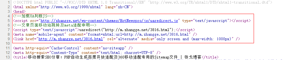
每种类型的页面仅出现对应的 meta 标注,则为成功!
以上关于谷歌开发适配的方法参考自:《移动 SEO 方案及注意事项》,张戈博客提供的是动态 meta 标注方法。
写在最后:
至此,张戈博客关于移动适配和开放适配的研究就真正告一段落了!搜索引擎的覆盖面已经足够广了!
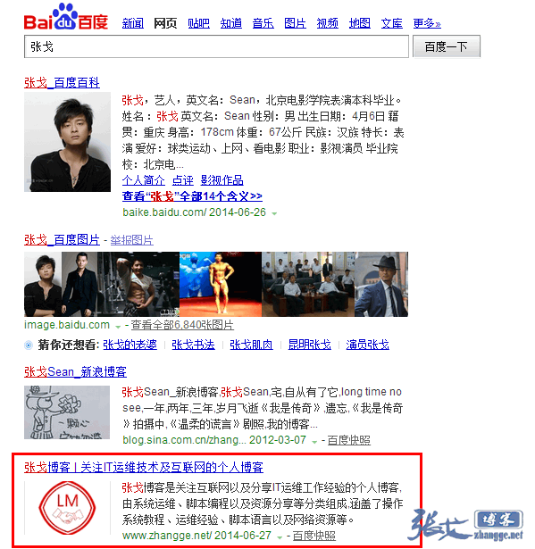
至于做 seo 有没有用?张戈可以肯定的告诉你,绝对是有用的!质疑的朋友可以随时查看张戈博客的收录和排名情况,虽然张戈并未对博客的关键词排名做优化,但是已收录的关键词一直在稳步上升,比如【张戈】这个关键词已经从第 4 页 27 名慢慢爬到了第一页第 4 名:
另外,关于博客的技术类文章最近总是出现无聊灌水以及不受欢迎的现象,张戈还是那句话,张戈一个 IT 屌丝,文笔确
实挺烂,因此只有当你有需求的时候你才会认真看,才会看得懂;所以,不喜勿看,不喜勿评,省得浪费您的宝贵时间,是不?看不懂的童鞋请转至留言板灌水即可~文章页真心不需要无畏的捧场,张戈博客的技术文章只写给有需要的人,谢谢了!


看起来很强大啊。每天噜一下AD。共进步。、
其实我什么都没点,你还不知道么?
响应式主题无压力。。
总感觉用响应式的有种优越感。。。 其实响应式也需要做一些优化标注。
这个不错哈,这个可以有
移动端的适配
请问多说评论鼠标滑过头像旋转是怎么做到的?
已分享:https://zhang.ge/3206.html
这个教程写的不错,学习了。
感觉还是不习惯文章内容中有广告区。 哈哈 还是觉得放别处会好点
移动端没怎么去处理,放了最简单的适配。
收藏了,有时间看看!
这教程不错,关注了。
坐等谷姐回来
我的多说登陆之后,怎么自动调转到后台登陆地址了啊, 怎么修改到调整到当前页面啊
这个不清楚。。